Pantone 2014 Color of the Year
What IS Pantone's Color of the Year? I'm so glad you asked. Every year, Pantone selects one color that they believe best describes that year - not only in design, but also in fashion and beauty products. Here's a little more information about the colors Pantone chose over the last decade or so.
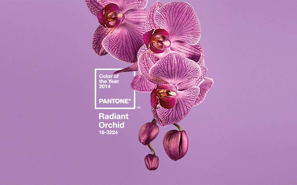
For 2014, a color called Radiant Orchid was chosen.
I think it's a lovely color, and decided to put together a moodboard with some products that you could buy to integrate this great color into your own home.

1. This rug from Rugs USA is a great way to integrate various shades of purple into a room
2. These curtains from IKEA are fun and have just a hint of Radiant Orchid in them, along with a really fun pattern. These would be great in a little girls' room or a casual family room.
3. This pillow from IKEA is almost exactly the same shade as Radiant Orchid! I love the dual-tone effect of the shiny and matte fabrics.
4. This lamp shade from Lamps Plus is such a lovely dark shade of plum. I know it's not exactly the same as Radiant Orchid, but it "goes" with it.
5. This accent chair from Target is so fantastic! The ikat pattern is so unexpected and different, and it actually would go really well with the curtains (#2!) from IKEA!
6. Finally, this throw blanket from IKEA is such a nice dark plum that would look great on a couch, along with some other purple accessories in the room.
So, hopefully you're inspired to get out and find some Radiant Orchid to add to your house!
For 2014, a color called Radiant Orchid was chosen.
 |
| Source: Pantone |
1. This rug from Rugs USA is a great way to integrate various shades of purple into a room
2. These curtains from IKEA are fun and have just a hint of Radiant Orchid in them, along with a really fun pattern. These would be great in a little girls' room or a casual family room.
3. This pillow from IKEA is almost exactly the same shade as Radiant Orchid! I love the dual-tone effect of the shiny and matte fabrics.
4. This lamp shade from Lamps Plus is such a lovely dark shade of plum. I know it's not exactly the same as Radiant Orchid, but it "goes" with it.
5. This accent chair from Target is so fantastic! The ikat pattern is so unexpected and different, and it actually would go really well with the curtains (#2!) from IKEA!
6. Finally, this throw blanket from IKEA is such a nice dark plum that would look great on a couch, along with some other purple accessories in the room.
So, hopefully you're inspired to get out and find some Radiant Orchid to add to your house!


Comments
Post a Comment